Defining the Pill System: A Guide to Visual Consistency
OVERVIEW
One of the tasks as an intern at Software Engineerings Professionals (SEP) was to create consistency through pills. They are referred to as pills because they are not clickable. My task was to figure out the best visual solution across the web app to have consistently throughout the app so that the client can have a seamless experience.
STEP 1
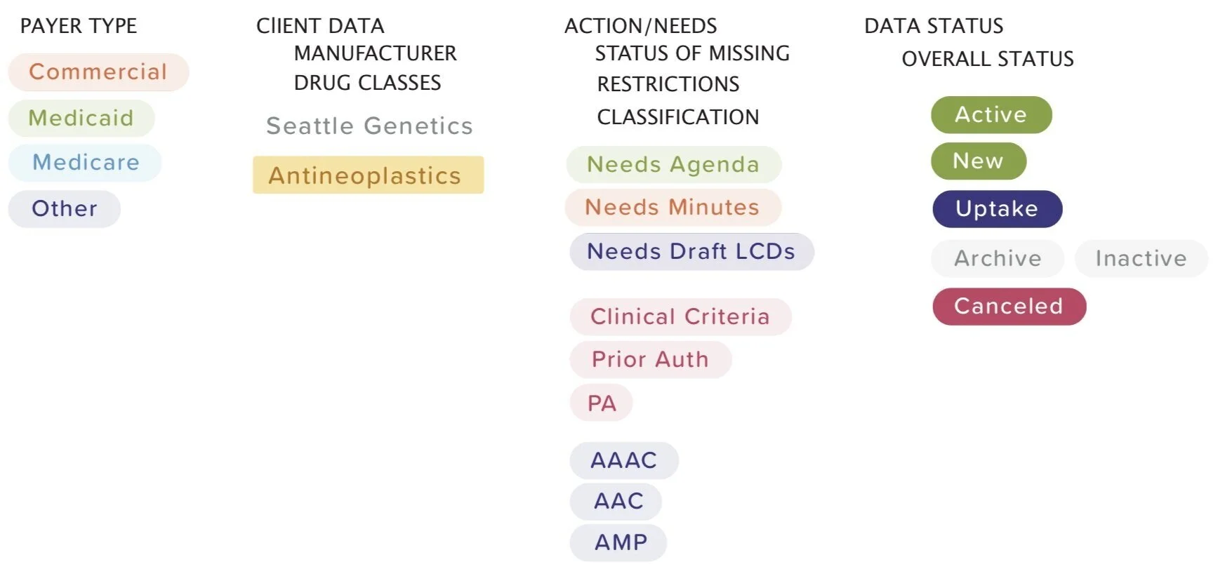
First, I compiled all the pills onto one page to view them on a grand scale. I noticed all the variations across the web applications. On the right, is the image of all the pills across the web application. I separated each page in bold, capitalized words. Under the headers, I have included visuals of the pills.
STEP 2
Second, I started placing the pills into categories by the meaning of the pills, colors, and text style. This was the first layer of trying to understand how the pills should look across the web app. This glance gave me an understanding of how the pills are related to one another across the web app.
STEP 3
Third, I started creating combinations. This view gave me a better visual understanding of the overlapping of the pills. I started noticing patterns and how the pills are combined visually.
PROPOSED SOLUTION
• Light pill to classify
• Indigo is for classification and abbreviation
• Green is for actions (new, active, good)
• Grey tint with dark text is for non-active items
• Red with white text is for cancelations (data item)
• Red tint with red text is for action items


