Navigating the Navigation
Team Members: Design Lead, Sr. Director of Engineering, Front end-developer + Me
My Role: Problem definition and visual design
Tool: Figma
OVERVIEW
B.well Connected Health is a platform that offers consumers a holistic view of their health records. B.well will collect all of your health records in one place, whether it is for you or someone you care for. Currently, b.well is seamlessly integrated into systems like Walgreens and soon Samsung Health and other health systems across the country.
TEAM PROCESS
• Understanding the problem
• Research
• Designing the solution
The embeddable application experiences challenges with navigation due to conflicting patterns within the parent app’s structure. To minimize user confusion, we’ve opted for unconventional navigation methods. While this approach may pose risks, it allows us to explore innovative solutions. Our decision was informed by insights gathered from two platforms, Walgreens Heath Access and Northwell Health, which helped identify specific pain points and technical constraints.
PROBLEM SPACE & SCOPE
HOW CAN WE INTEGRATE B.WELL'S NAVIGATION INTO ANOTHER APPLICATION WITH AN EXISTING MENU?
IDEATION & SOLUTION
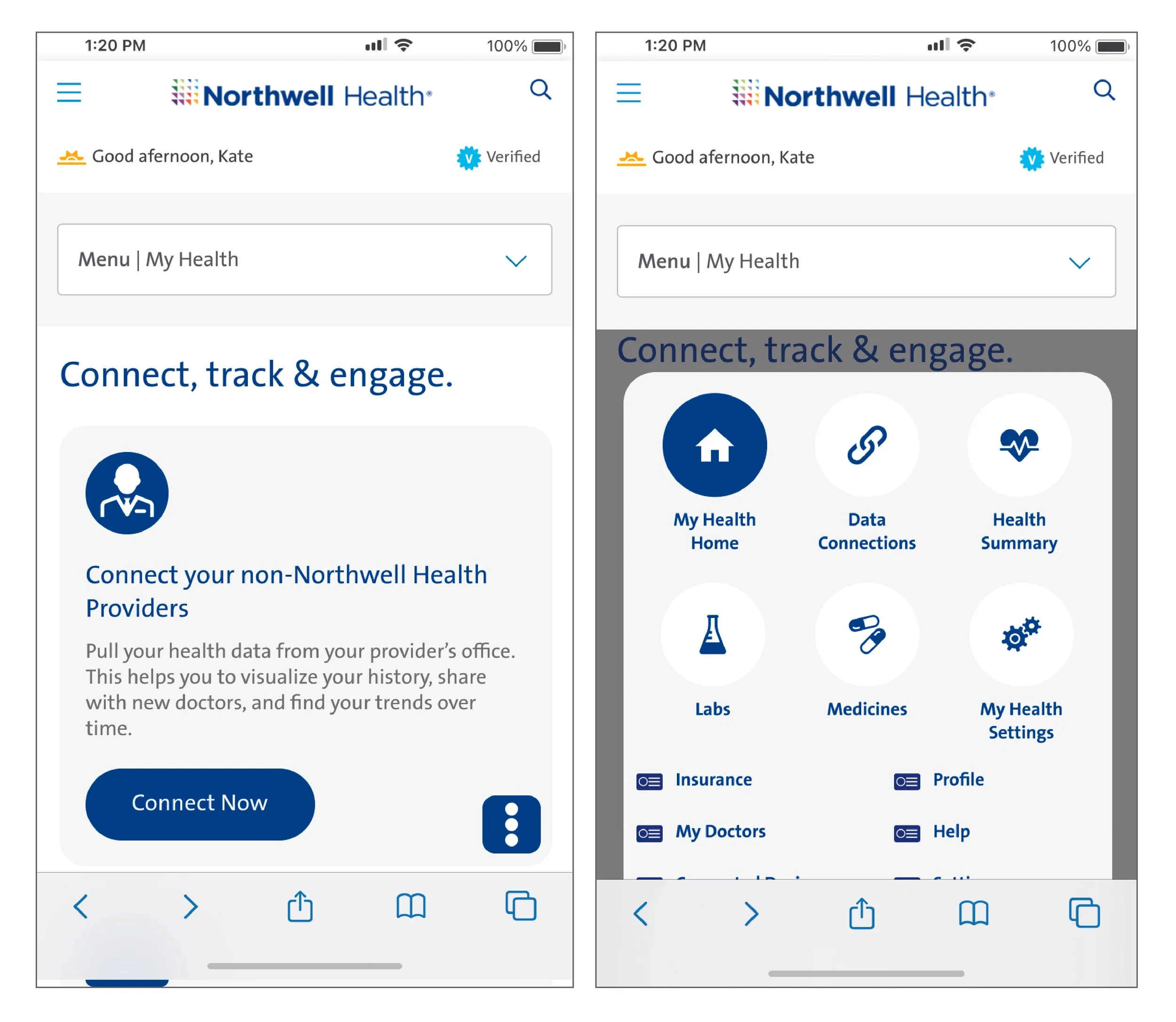
Our initial design had a dropdown menu that sticks to the parent element (image on the right). While this solution proved effective for one client, it posed a technical constraint for others. Specifically, certain elements stick to existing components of the app, rendering the design impractical. To address these technical constraints, it is essential for our development team to understand the extent of each client’s existing navigation. Without this information, our design risked being behind their container.
Here is a list of constraints (from design and development) we found:
Couldn't use general icons: home, hamburger, six dots, profile image, names
Couldn't stick or have floating items due to technical constraints of not knowing the client app’s navigation height
We need to use client branding.
The solution needs to work for all clients, embeddable (Walgreens and Northwell) and legacy clients (b.well)
Clients already have bottom navigation bar in their mobile apps.
Northwell client already had
Two types of menus on their web browser
Drop down (this stuck to the top once a user scrolled)
The hamburger menu that swiped vertically in
Once we compiled a list of constraints we discovered, we gained an understanding of various placement options for our navigation within the two-parent apps. These options allowed us to come up with four solutions.
FINAL DESIGN & OUTCOMES
In our short timeframe, we found a solution we thought would best fit the problem. We were not able to do user testing, so we decided to test live to see how users interact with the product. Our final design (shown on the left) for the navigation has an up-and-down arrow that indicates to the user that there is something that “opens.” The file icon and {{client.productName} Home} will update when a user goes to other pages. Below is an example of the final design across Walgreens Health Access and Northwell Health.
OUTCOMES
After implementing the updated navigation design, we analyzed feedback from stakeholders and users, leading to the following results:
Enhanced user clarity: The redesigned navigation approach reduced user confusion, leading to smoother interactions within the embeddable application.
Improved user flow: The redesign resolved conflicting navigation patterns, resulting in a more intuitive user experience across platforms.
Reduced navigation-related support requests: The new navigation method led to a decrease in user support queries, indicating a more user-friendly interface.

