Designing a Personalized Onboarding Experience for BCBS Louisiana
Team Members: UX Writer, Product Manager, + Me
My Role: High-fidelity prototype, UX research
Tools: Figma, FigJam, Maze
OVERVIEW
B.well Connected Health is a platform that offers consumers a comprehensive view of their health records. B.well consolidates all of your and your loved ones’ health records into a single platform. Currently, B.well is seamlessly integrated into systems like Walgreens, Samsung Health, Blue Cross Blue Shield, and other health systems nationwide.
BCBS of Louisiana is launching a new app allowing users to easily manage coverage, track claims, access digital ID cards, connect health records, and receive personalized health tips—all in one place. Our team was tasked with introducing an onboarding feature that begins right after account creation to help acclimate users to the new features.
What to expect in this case study:
• Final solution & hypotheses — A preview of the onboarding flow and how we’ll measure success
• User research & insights — Key themes from surveys and workshops that informed the experience
• User flow & information architecture — How we structured the onboarding journey for clarity and personalization
• Content strategy & design rationale — How we aligned copy, visuals, and functionality to user needs
• Interaction design — A deep dive into question flows, UI decisions, and screen logic
FINAL SOLUTION & HYPOTHESIS
Since this feature will be introduced to the users in early fall, I will share some hypotheses for the onboarding journey.
Hypothesis
Increase frequency and volume of user interaction: They will complete tasks like collecting medical records and completing questionnaires to give us data points to give them better health insights.
Patient satisfaction: By surveying users before and after the onboarding journey, we want to see how users' overall experience with the platform changes.
Rate of engagement: We will track engagement using metrics such as log-ins, usage of data connections, health summary, and participation throughout the app.
Retention rates: Over 6 months, we will compare the cohorts with and without the onboarding journey.
UNDERSTANDING OUR USERS
Onboarding is slightly different from regular onboarding, where the focus is to get them into the core product in the few steps possible. In digital health products, it is essential to collect ample information from them. The data we collect is crucial for offering relevant recommendations and actionable insights, ultimately leading to better overall health and outcomes. Healthcare is already complex and confusing, and adding a digital app could make it even more overwhelming. By the end of the onboarding journey, I want the consumers to be able to understand and fully realize the app’s value by completing key tasks throughout the journey. My goal is to create a simple, intuitive, and straightforward onboarding experience.
PRIMARY & SECONDARY RESEARCH
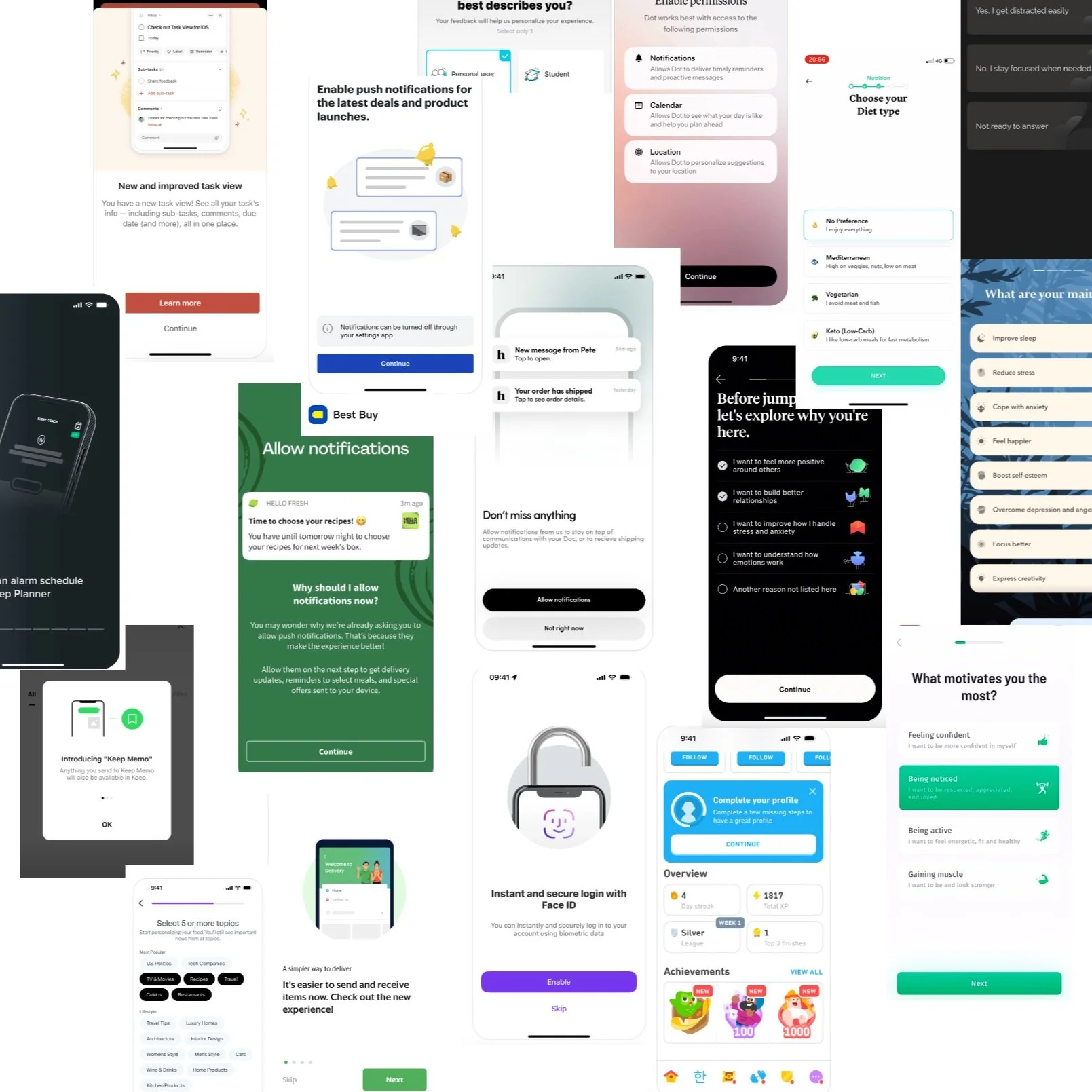
Inspiration from Mobbin to see what other apps' onboarding flow looks like.
Every successful onboarding strategy starts with an in-depth understanding of our user base, in this case, understanding our payor users. Since this was our first payor client, our team implemented a Maze survey and led a core value workshop to understand what users want from their insurance apps and what onboarding flows tend to overwhelm them and reduce completion rates.
Based on our research, I found a few themes:
Context Sensitivity and Personalization: This emphasizes the importance of tailoring the onboarding experience to individual user needs. By avoiding redundant information and leveraging existing data, the process becomes more efficient and user-friendly.
Effort Reduction and Automation: This focuses on minimizing the burden on users by automating repetitive tasks and pre-filling information when possible. This theme advocates for proactive support by guiding users seamlessly through the onboarding process and integrating necessary data connections effortlessly.
Time Sensitivity and Guidance: This addresses the need for a timely and well-structured onboarding process. It highlights the importance of clear instructions, real-time progress updates, and setting user expectations regarding the time and steps involved. This approach ensures that users are never left wondering what to do next.
Communication and Education: This stresses the importance of clear, empathetic communication and educating users throughout the onboarding experience. This theme advocates for transparency and building trust by explaining the reasons behind each step and showing the product's value, rather than just telling users about it.
Earning Users' Trust: Transparency is an essential component of any health system. We assure users that their sensitive data is secure by clearly communicating the security measures in place during the onboarding process. We ask for only the essential details and collect the minimum amount of data needed, which will be solely used for the specific task at hand.
USER FLOW & INFORMATION ARCHITECTURE
Since onboarding is mostly content and how it is delivered to the user, I began by creating a three-part onboarding journey, during which we learn more about the users, establish communication preferences, and facilitate a data connection. I worked with our UX copywriter to create a simple user flow, which served as our prototype to understand how users would flow through each step.
From there, we start the content process and the information architecture. My role in the content process was to help our UX writer with ideation and being flexible with the workflow. The goal of the information architecture is to create a structured blueprint of the product’s content and functionality. This is done by outlining all of the product's sections and screens, along with the features and capabilities on each screen. Here is the full user-flow.
The breakdown of each of the sections:
Intro Card x 3
Account Creation
Welcome
Onboarding Intro and Questionnaire
Success/ Feature Intro Screen
Feature Highlight Carousel x 5
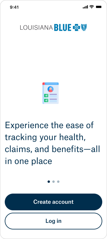
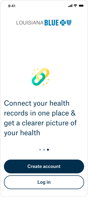
Let’s start with the first section, which is the Intro Cards. These intro cards will help users understand the new features they will get in the app. Based on the research, this follows the Communication and Education theme because it helps them quickly realize the insurance app’s benefits and know that this insurance app goes beyond insurance.
Screens
Content
- App logo
- Illustration icon
- Text container
- “Create Account” CTA button
- “Log In” CTA button
Functionality
- Horizontal carousel automatically scrolls through value props of the app (swipe after 2,500ms) - we also allow for manual swipe to see next section
- “Create Account” button takes user to account creation flow
- “Log In” button takes user to log in screen
The following section is about Account Creation. For this case study, I will not discuss account creation since it has no role in onboarding. However, I did add this to our workflow since account creation is a sub-piece of onboarding.
The third section is about Welcoming and introducing the value props to the user. Based on the research, this follows the Communication and Education, along with Earning Users Trust themes. I want to educate the users about the value this app can bring to their health and keep them engaged over the long term. My idea here was to bring back the idea that this app goes beyond insurance
Content
- App logo
- Headline
- Subheadline
- 4 Feature block text containers
- “I’m ready!” CTA button
Functionality
- The headline will include First_Name
- Each feature block will have an icon and paragraph text
- “I’m ready!” button will take the user to the next page
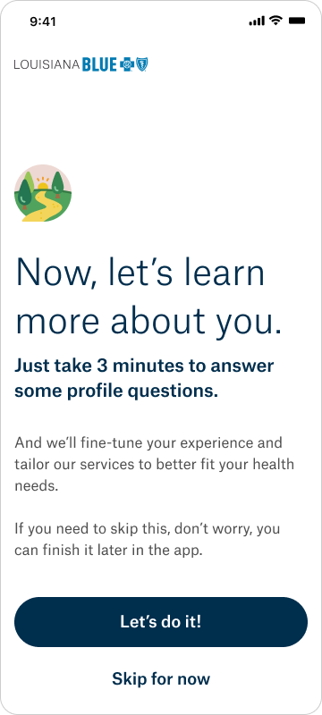
Next is the Onboarding Intro and Questionnaire portion, which aligns with both Context Sensitivity and Personalization, as well as Time Sensitivity and Guidance. These Intro and Questionnaire screens will help us learn about the user, enable their preferences, and start the data connection. We started with a “Learn more about you” screen, where we explained to the users why we were doing this, how long it would take them, and what they would get out of it. In this section, I want to emphasize the importance of personalizing their in-app experience, along with giving clear instructions and setting expectations of how long it would take them. I don’t want users to leave this page with uncertainty about the benefits of this app.
Onboarding Intro Screen
Content
- App logo
- Illustration icon
- Headline
- Subheadline
- Paragraph text container
- “Let’s do it!” CTA button
- “Skip for now” CTA button
Functionality
- “Let’s do it!” button will take the user to the questionnaire
- “Skip for now” will take the user to Success/Feature Intro Screen
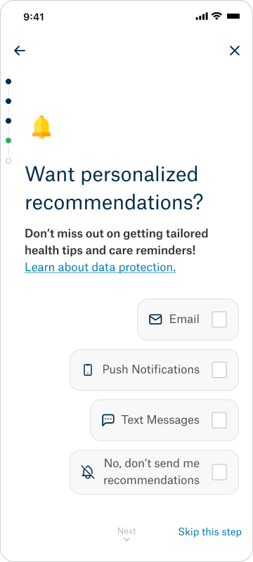
We asked users these four questions based on the interactive features within the app:
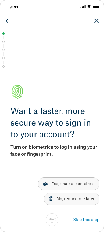
Want a faster, more secure way to sign into your account? (Enable biometrics)
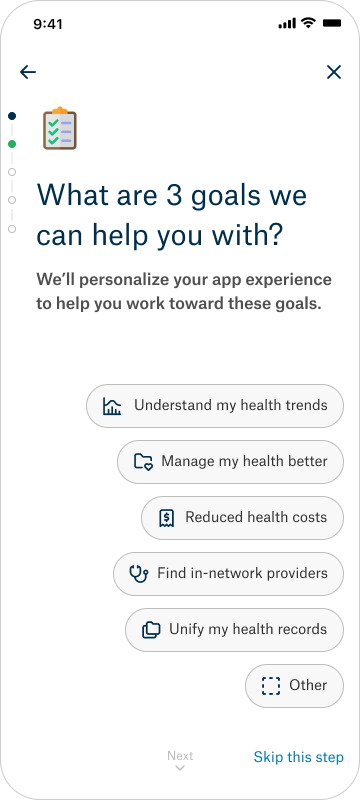
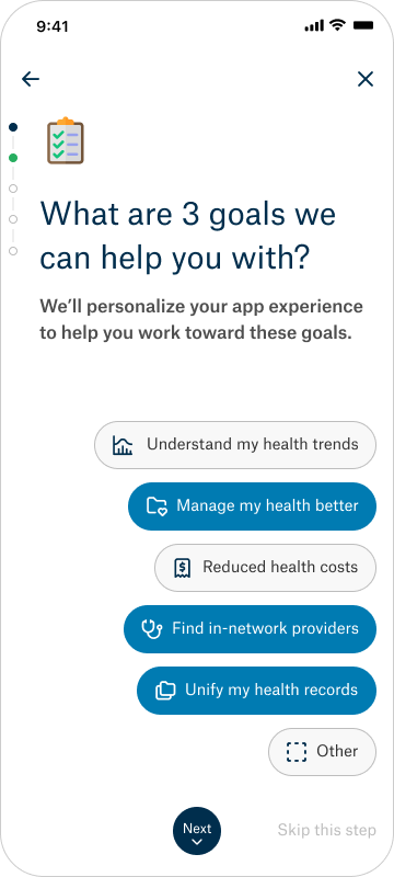
Aside from understanding your insurance, what are your top 3 goals? (Goals)
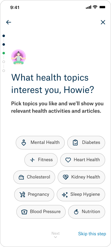
What health topics interest you?
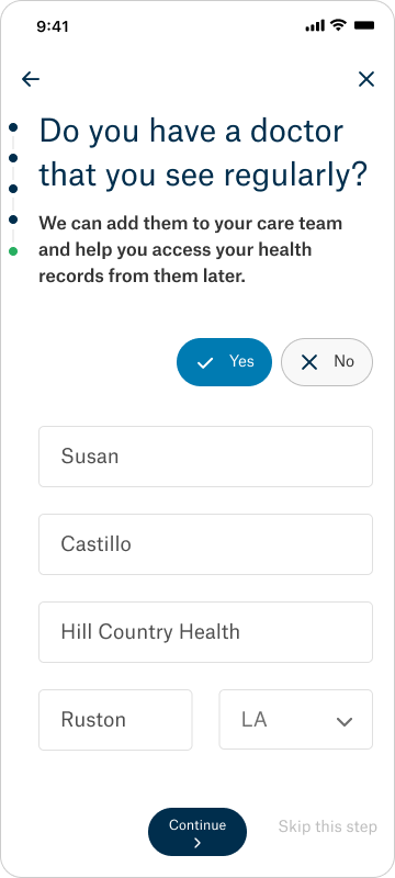
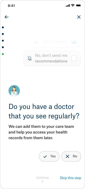
Do you have a doctor that you see regularly?
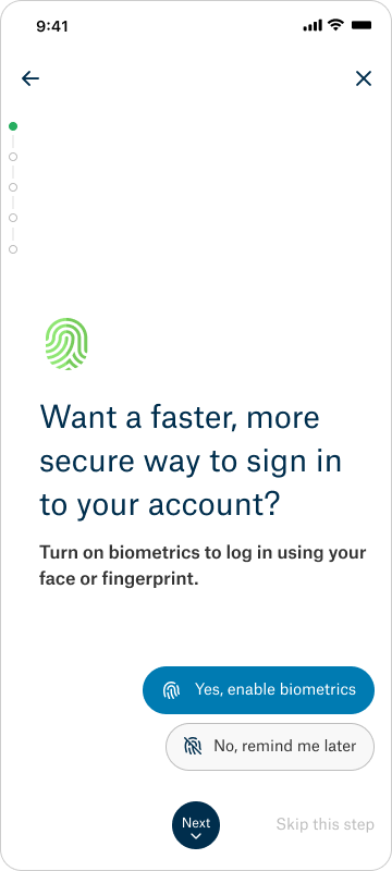
The first question is about biometrics. We want the users to have a seamless experience while signing into the app.
Enable biometrics Screen
Content
- Back arrow > top left corner
- “X” > top right corner
- Vertical Progress bar
- Illustration icon
- Headline > left, bottom aligned
- Subheadline > left, bottom aligned
- “Yes, enable biometrics” CTA button > right aligned, stacked vertically
- “No, remind me later” CTA button, > right aligned, stacked vertically
- “Next” button, > center aligned at page bottom
- “Skip this step” button > right aligned at page bottom
Functionality
- Back arrow will take the user to the previous page
- “X” will take the user to the Success/Feature Intro Screen
- “Next” button will be disabled till the user selects one of the CTA options
- Once they select an option the button will enable
- “Skip this step” button will be enabled till the user selections one of the CTA options
- Once they select an option the button will disabled
- User selects options, clicks “Next” to advance the screen upward to the next question. The progress bar indicator moves.
The second question is understanding their goals and their reasons behind using this app, which helps us create a personalized homepage. For example, if the user selects “Managing my health conditions better,” based on their data, we would recommend certain screenings or articles to give them a better insight into their condition.
Goals Screen
Content
- Back arrow > top left corner
- “X” > top right corner
- Vertical Progress bar
- Illustration icon
- Headline > left, bottom aligned
- Subheadline > left, bottom aligned
- 6 options (pill containers) > right aligned, stacked vertically
- “Next” button > center aligned at page bottom
- “Skip this step” button > right aligned at page bottom
Functionality
- Back arrow will take the user to the previous page
- “X” will take the user to the Success/Feature Intro Screen
- User will select 3 of the the 6 options
- Each button will include an icon and content
- “Next” button will be disabled till the user selects 3 of the 6 options
- Once they select the 3 options the button will enable
- “Skip this step” button will be enabled till the user selections 3 of the 6 options
- Once they select 3 options the button will disabled
- User selects options, clicks “Next” to advance the screen upward to the next question. Progress bar indicator moves.
The third question is about health topics so that we can showcase articles that are significant to them.
Health Topics Screen
Content
- Back arrow > top left corner
- “X” > top right corner
- Vertical Progress bar
- Illustration icon
- Headline > left, bottom aligned
- Subheadline > left, bottom aligned
- 12 options (pill containers split into two 6 option columns stacked vertically & right aligned)
- “Next” button > center aligned at page bottom
- “Skip this step” button > right aligned at page bottom
Functionality
- Back arrow will take the user to the previous page
- “X” will take the user to the Success/Feature Intro Screen
- We currently have 10 health topics (more depending on other clients)
- Each button will include an icon and content
- “Next” button will be disabled till the user selects at least one button
- Once they select the 1 button the “Next” button will enable
- “Skip this step” button will be enabled till the user selects at least 1 button
- Once they select 1 button the button will disabled
- User selects options, clicks “Next” to advance the screen upward to the next question. Progress bar indicator moves.
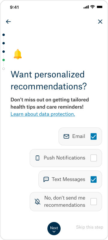
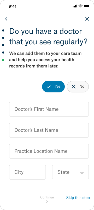
Finally, the last question has two parts and focuses on data connection. First, we ask the user about their previously visited doctors to check if we have an existing portal connection. If not, we’ll establish one for them. Once we establish a portal connection, we will ask the user to create a connection on their homepage. This is a two-part process to avoid leading the user into a search funnel. The onboarding is designed to be quick and easy. Since this is an insurance app, users primarily come to check their coverage and asking about their provider introduces them to the broader context.
Provider Screen
Content
- Back arrow > top left corner
- “X” > top right corner
- Illustration icon
- Headline > left, bottom aligned
- Subheadline > left, bottom aligned Option 1 - we don’t have data
- “Yes” CTA button
- “No” CTA button > stacked horizontally, right aligned
- “Continue” button > center aligned at page bottom
- “Skip this step” button > right aligned at page bottom Follow up question
- 5 Form Fields > 3 full-width across the screen, last 2 are half-width & horizontal to each other with the one on the right being a drop-down
- “Continue” button > center aligned at page bottom
- “Skip this step” button > right aligned at page bottom Option 2- we have data
- 1-3 checklist cards
- Provider image
- Provider name
- Provider Specialty
- Location Icon
- Location name
- “Continue” button > center aligned at page bottom
- “Skip this step” button > right aligned at page bottom
Functionality
- Back arrow will take the user to the previous page
- “X” will take the user to the Success/Feature Intro Screen Option 1
- If the user selects “Yes” they will be taken to the follow up question
- Form fields include; Doctor’s first name, Doctor’s last name, practice location name, city, and state -“Continue” button will be disabled till the user fills out the form field
- Once they fills out the form field the “Next” button will enable
- “Skip this step” button will be enabled till the user fills out the form field
- Once they fills out the form field the button will disabled
- User selects options, clicks “Continue” to the transitional page
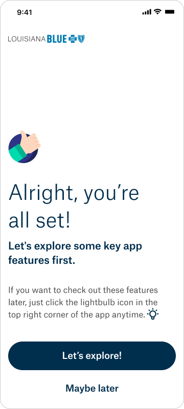
The last part of this onboarding experience is the Success/Feature Intro screen, which, based on the research, follows the Communication and Education theme. I want to educate the users about the other features the insurance company offers beyond insurance. If I get the users to understand the app and its features, the rest of the journey will become easier for the user. It can get the users comfortable navigating the app, help them understand its purpose, and help with retention. It gives the users another introduction to the app and sets the tone for their overall interaction.
Success/Feature Intro Screen
Content
- Illustration Icon
- Headline > left, bottom aligned
- Subheading > left, bottom aligned
- Paragraph text container
- Icon > inside of text container
- “Let’s explore!” CTA button
- “Maybe later” CTA button
Functionality
- User clicks the “let’s explore!” CTA button to go to the Home page with the feature highlight carousel displayed.
- User clicks the “Maybe later” CTA button to go directly to the Home page without the feature highlight carousel displayed.
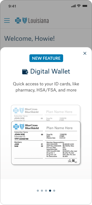
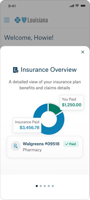
Feature Highlight Carousel x 5
Content
- “X” > top right corner
- “New feature” chip > center aligned
- Icon + Header text > center aligned
- Description text container > center aligned
- Illustrated design block
- 5 carousel indicator dots
Functionality
- User swipes through carousel slides to view features.
- Upon swipe, progress is tracked by indicator dots at the bottom of the screen.
- “X” will take the user to the Home page
- “New feature” chip will only be shown if the feature is new
SCREENS


