RANI REBRAND
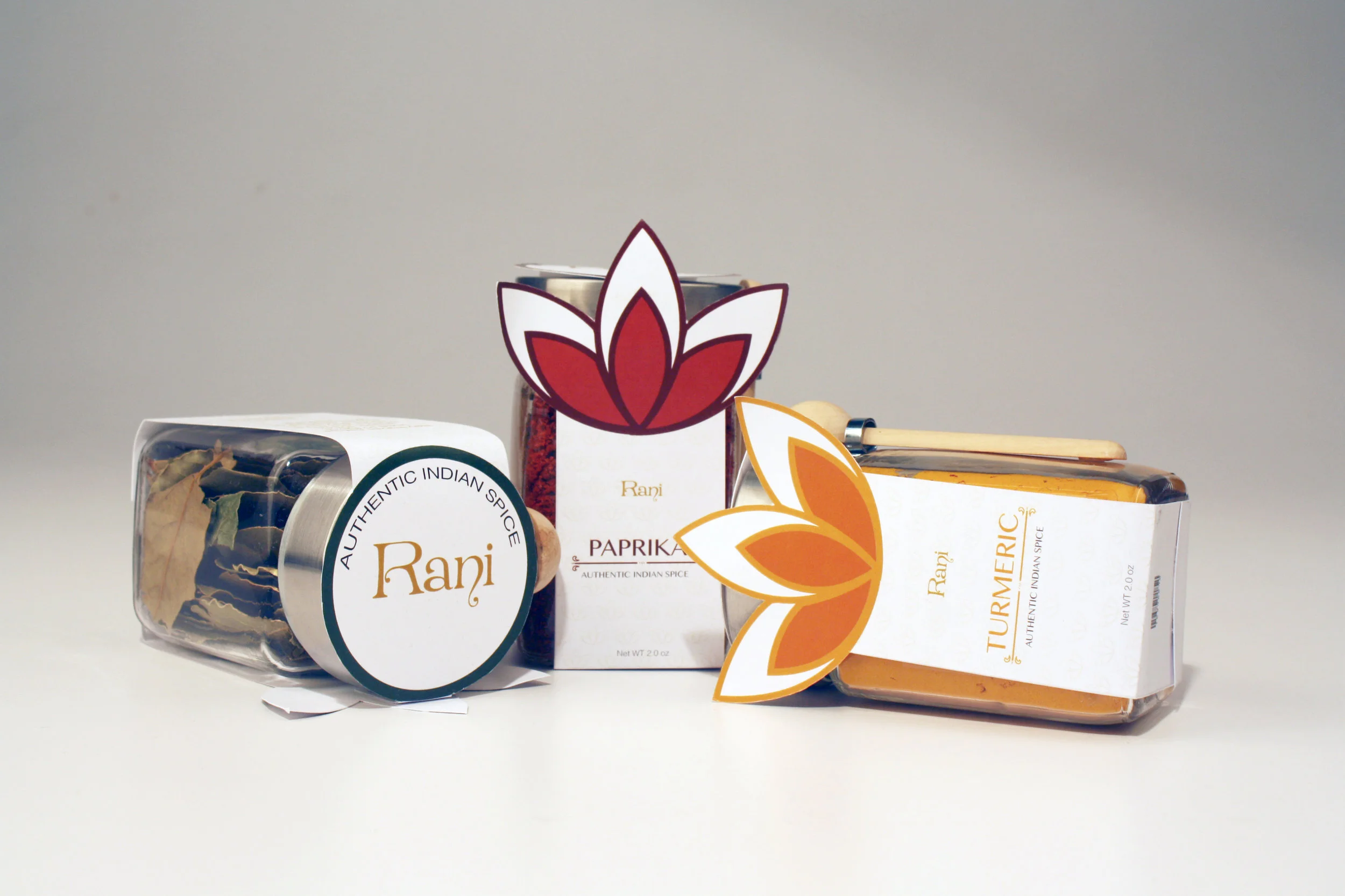
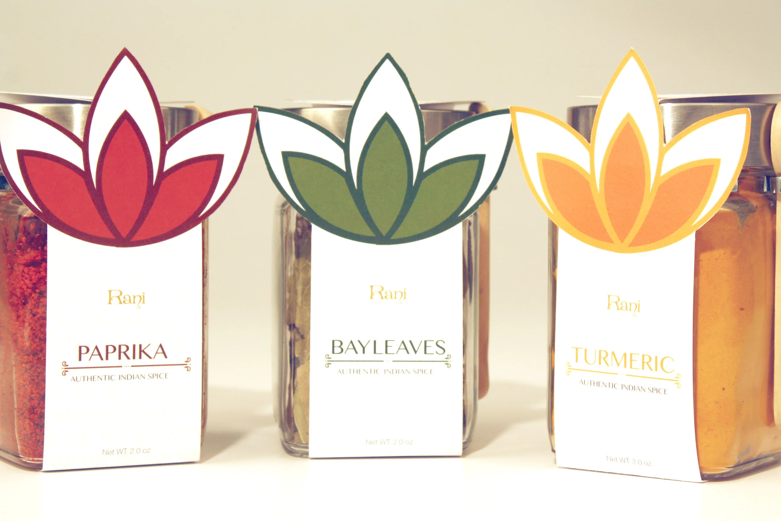
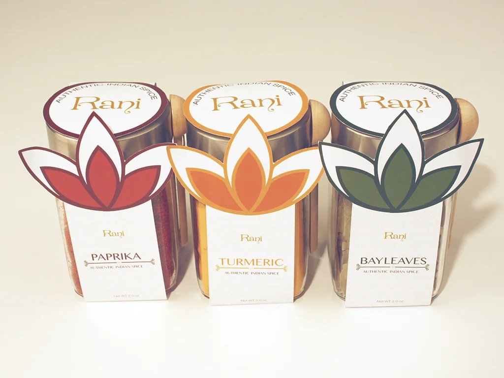
Ramesh and Phulan Chander opened Rani Brand in 1979. Authentic ingredients were hard to find in the U.S., so they decided to open up the first Indian Ethnic store in Southern California in 1979. They specialize in Indian spices and foods. There are over three hundred varieties of spices and blends. The target audience would be men and women that like to cook with exotic spices. The message is to enjoy cooking something different that uses a mix of spices. Some tones are organic, purity, exotic, ethnic, and cultural. The construction of the packaging would be minimal, that has an Indian heritage feel. There will be ornate designs as texture. The color pallet would be rich earthy tones (red, green, yellow, etc.). The colors would be earthy tones because the spices are organic and natural. The logo will have a heritage feel to it with an ornate design. Tin lid with glass bottle will be used to show the color of the spice. When people see it on the shelf, they will look at the vibrant color and get excited to use the spice.
The look and feel of the packaging:
The construction of the packaging would be minimal that has an Indian heritage feel. The color pallet would be rich earthy tones (red, green, yellow, etc.). The colors would be earthy tones because the spices are organic and natural. The logo will have a heritage feel to it with an ornate design. Tin lid with glass bottle will be used to show the color of the spice. When people see it on the shelf they will be able to look at the rich colors and get excited to use the spice.


