
While building personas for Shaadi Simplified, I kept noticing the same thing. When wedding planning goes sideways, couples almost always blame themselves.
"We're bad with money." "Our families are impossible." "I'm so disorganized."
As a designer, those sentences set off alarm bells. When lots of people struggle in the same way, it's rarely a people problem. It's usually a design problem hiding in plain sight.
So this week, I'm flipping five of the most common wedding complaints to show what's really going on underneath, and what I'm designing to fix each one.
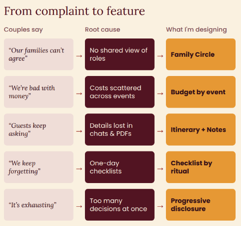
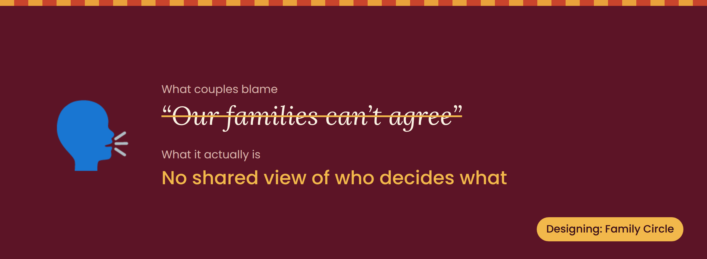
South Asian weddings are a group project with dozens of stakeholders. Parents, aunties, cousins, and the couple all have opinions, and often nobody knows who has the final say on what. It isn't that families can't agree. It's that nobody can see who's deciding what.
That's why Family Circle is on my MVP list. When everyone can see who owns the mehndi décor and who's talking to the caterer, a lot of the conflict quietly disappears.
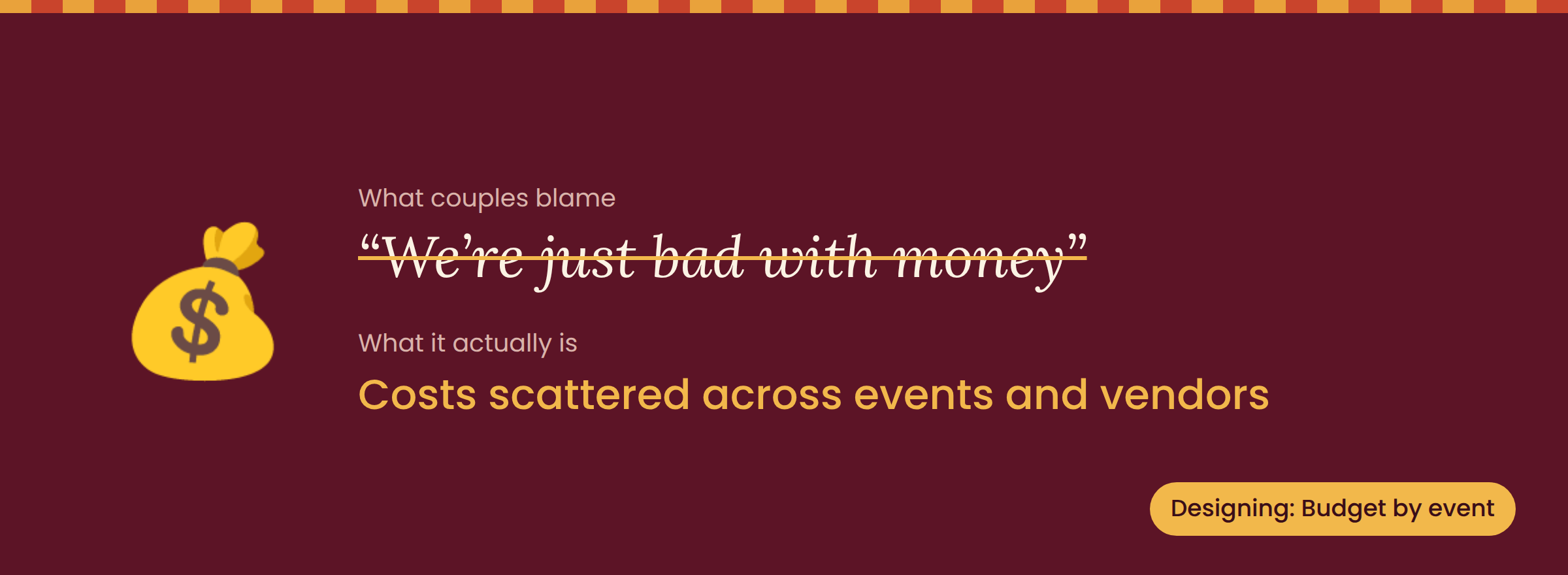
Most couples aren't bad with money. They're juggling costs spread across four or five events, dozens of vendors, and a spreadsheet that three people edited differently. 😅
My Budget Tool breaks spending down by event, so couples can see where the money is going before it's gone. A running total beats a end-of-wedding surprise every time.
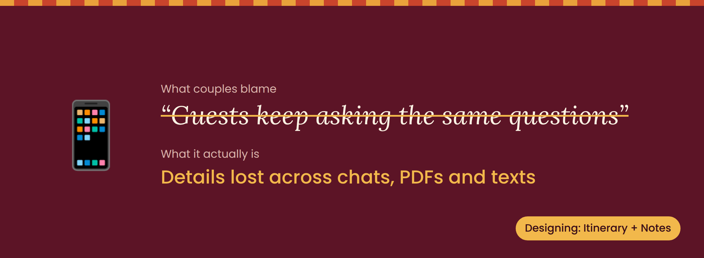
"What time is the sangeet?" "Is the haldi indoors?" "What am I supposed to wear?" Sound familiar?
Event details end up scattered across WhatsApp threads, PDF invites, and random texts. Itinerary + Notes gives everything one home, so answers are easy to find instead of buried 400 messages deep in the family group chat.
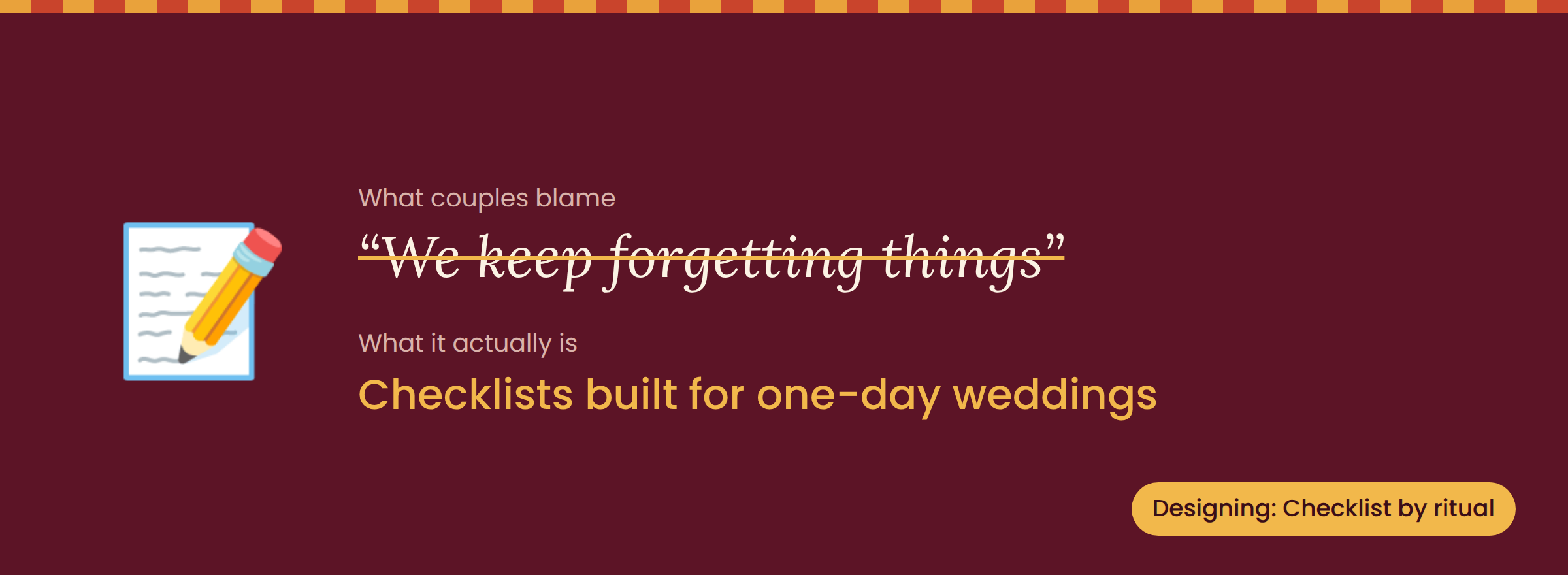
Most wedding checklists are designed for a one-day Western ceremony. They don't account for multiple days, ritual items, or the order events happen in. No wonder things slip through the cracks.
My Wedding Checklist is organized around each event and ritual, so tasks show up exactly where they belong. Forgetting the coconut for the ceremony? Not on my watch.
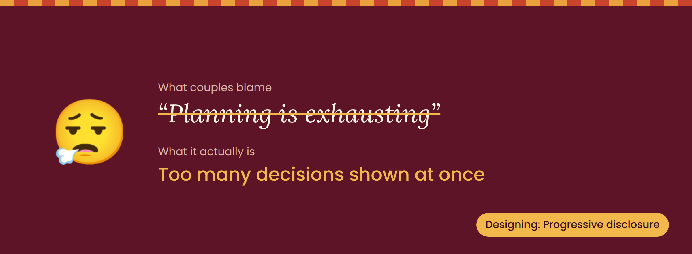
Planning a wedding means making hundreds of decisions. When a tool throws all of them at you on day one, burnout is almost guaranteed.
This is where a design principle called progressive disclosure comes in: show people only what they need right now, and reveal the rest when it becomes relevant. It's also why I kept my MVP to just five features. Less, but better.
What I Learned
Reframing complaints like this is one of my favorite parts of product design. It's a lightweight version of the "5 Whys": you keep asking "why?" until you move past the symptom and find the root cause.
What surprised me is how cleanly every feature on my roadmap traced back to one of these reframes. That's a good gut check. If I can't connect a feature to a real user frustration, it probably doesn't belong in the MVP.
And the biggest takeaway, for anyone designing anything: if users are blaming themselves, look at the design first.
Which of these five sounds most like your (or your friends') wedding planning experience? Tell me in the comments. Bonus points for your best family group chat story. 😂